In today’s hyper-competitive, digital age, organizations worldwide need to be able to push code to production and launch new website features and content faster than ever without compromising quality. To address this need, continuous testing has become a critical part of the application development and delivery process.
Author: Guy Arieli, Experitest CTO, https://experitest.com/
However, with test automation mostly being performed today for functionality, many websites are left lacking usability. This is because functional testing doesn’t test for how a page looks across different browsers, devices, and screen sizes. And, in our mobile world – the endless variety of browsers, devices, and screen sizes – can’t be ignored.
This is where visual testing comes in, complementing the efforts of functional testing. However, the solutions available to date have made for a cumbersome process that doesn’t lend itself to automation.
The introduction of an automated visual testing tool changes all that. In this paper, we will cover the latest trends and tools for ensuring that only the highest quality of new website features and capabilities make it to market.
The Need for Speed
In our demanding age of digital, customer expectations for new and better experiences are constantly on the rise – and the competition to launch new and better mobile sites has never been fiercer. Indeed, innovation, quality, and speed are of the essence. Without them – brand loyalty, competitive positioning, and revenues are all at risk.
That’s why launching new website features and capabilities faster than ever is critical for every organization, and the standard in web-based application development is approaching continuous delivery.
Functional Testing Is Not Enough
When it comes to website testing today, for the most part, the focus is on functional testing, using Selenium-based cross browser testing. Selenium automates based on application logic, for testing functionality.
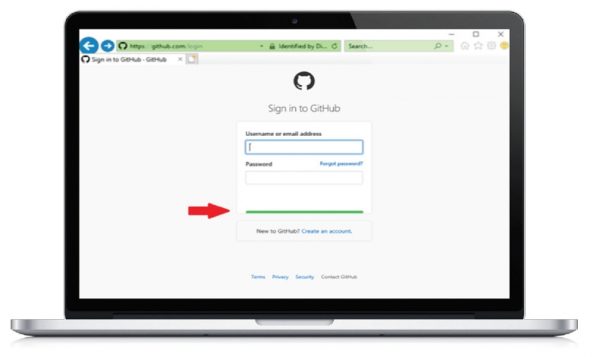
While functional testing is important, it is not sufficient for ensuring a great web user experience, because it doesn’t test how a page looks across different browsers, devices, and screen sizes. In fact, an automated functional test may pass with flying colors even when, in reality, the website lacks usability.
Take for example the screenshot in image 1. Here we have a screen that passed the functional test even though the action button is outside the area visible onscreen.
The Mobile Challenge
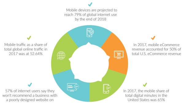
This is not a minor issue. We are living in a mobile-first world, and the same website is expected to provide a flawless user experience on any device, browser, and OS. Consider this:
Responsive Web Design for a Mobile World
Responsive Web Design (RWD) is the most common method to create a site that can accommodate the multitude of browsers, devices, and screen sizes. RWD has realized widespread adoption due to its ability to, for example:
- Ensure text readability without requiring zoom;
- Ensure adequate space for tap targets;
- Avoid the need for horizontal scrolling.
Moreover, website responsiveness is rewarded by the Google search algorithm for promoting a better user experience.
Yet, while RWD does provide significant support for avoiding certain functional defects, it does not address many of the UX issues that still occur today, for example – the way a page is rendered on certain displays.
Moreover, RWD isn’t simple to design for and develop. It can become complex, based on a long series of if/then calculations that are driven by queries about the device and display setting. The goal of these queries is to decide what should be presented to the user, for example, whether to collapse objects on the page or to reposition/resize them.
Due to its complexity, there may be bugs in RWD programming, which cause objects to appear differently from what was originally intended, or for the breakpoints to be executed inaccurately.
Not All Browsers Are Created Equal, or – The CSS Challenge
Part of the challenge in creating websites that display accurately and seamlessly on any browser or screen size is posed by the CSS (Cascading Style Sheets). CSS prescribes how HTML/XML elements should be rendered or displayed.
While CSS is a standard, there are differences in how it is implemented in different browsers and browser versions. The result is that a page may appear differently across the various browsers and devices.
Why Current Visual Testing Doesn’t Deliver
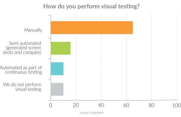
To compensate for when something goes wrong with how a web page is displayed, for whatever reason, visual testing is mandatory. Visual testing today, however, is mostly done manually, making for a very labor and time-intensive process, which frequently results in errors.
Current automated visual testing methods mainly rely on image capture and comparison. Limitations of this method are that test reuse for common elements is impossible, and extensive overhead for maintaining baseline images. These factors limit the effectiveness of image comparison in large scale continuous testing.
Consequently, organizations are faced with an impossible decision between long testing processes or releasing versions that were not tested visually.
Layout Testing: A Quick Primer
Luckily, layout testing provides a solution. Layout testing validates the way objects are laid out on a web page, i.e. their position, size, alignment, ordering, visibility etc. Since the layout of objects can be defined in code, a test can be written and results can be calculated using the code, and not images.
This approach lends itself to unprecedented automation. Basically, as you write the code for the site, you can also write the test and validate the code. Moreover, you can trigger automated tests, that are both visual and functional – running them both as part of your continuous testing process
Layout Testing and the Galen Framework
To effectively automate visual testing, it is important to make sure that in “real life” situations, the layout of the page appears on devices and browsers as intended. This can’t be done by using images. Rather, effective automation can only be done with programming that interfaces with the logical layer.
One tool that does exactly that is the Galen Framework, which is an open source framework for layout testing. It tests the location of objects relative to each other on a page. Using a special syntax and comprehensive rules testers can describe any layout imaginable.
The Galen framework relies on the Document Object Model (DOM) for layout testing. DOM is an interface for HTML and XML documents. It represents the page as it is rendered by the CSS – using nodes and objects. By using the DOM nodes and object, programming languages and automation tools can interface with the page.
In layout testing, Galen looks at how an object – for example the menu bar – is actually represented on the page under specific device and browser conditions using the DOM. Thus, through layout testing, we can arrive at a code-driven understanding of how the object was supposed to appear vs. how it actually appears on the page.
While Galen is very effective for testing object layout and visibility, at the end of the day it is a framework, not a tool. Thus, using the Galen framework for test development as well as for maintenance requires coding expertise.
The Key Capabilities Required for Overcoming the Challenges of Visual Testing
The key to overcoming the above-noted challenges is to have a tool that enables testers to leverage the benefits of layout testing but is easy to use. Specifically, such a testing tool would require the following elements:
- Layout-based testing using Galen, for a robust test automation approach that requires very little test maintenance;
- A GUI-based interface for easy test creation;
- High maintainability and reusability of tests;
- Integration with common cross browser automation frameworks such as Selenium;
- Integration with CI/CD tools, enabling a continuous testing process.
The Automated Visual Testing Tool from Experitest
Experitest introduces a revolution to visual testing, with our automated visual testing tool. Now you can easily validate that all buttons, text, and images are in the right position, proportion, and size.
Our solution enables you to easily develop layout tests and make visual testing a part of your CI/CD pipeline. You can verify UI responsiveness across different resolution screens and windows during automated cross browser testing, to ensure a consistently great user experience on any device or screen size.
Solution Highlights
Automate Visual Tests with Ease
A GUI based web application testing interface enables you to create and run automated visual testing with ease, based on the Galen open source framework. Moreover, the tool functions as a Chrome extension to enable easy real-time interaction with your web page.
A Visual Test Editor
The drag-and-drop Visual Test Editor enables you to easily pick and add any UI element to your responsive web testing. It also allows you to easily define specs, where each layout testing spec defines the rules regarding size, position, and proportion of UI elements.
Large Scale Cross Browser Execution
Get instant feedback by executing your visual tests across 1000+ of devices and browser versions as part of CI pipeline with the SeeTest Digital Assurance Lab.
About the Author
Guy Arieli, Experitest CTO, brings 20+ years of test automation experience for leading companies including Hewlett Packard, and Cisco. Guy founded the Test Automation services company TopQ, which he sold to the publicly traded Top Group. Guy administrates the largest online Test Automation forum and frequently speaks at industry events.
Contact SoftwareTestingMagazine.com if you want to contribute quality software testing and software quality assurance content on this website.


